Make your WordPress HTML tables responsive on mobile
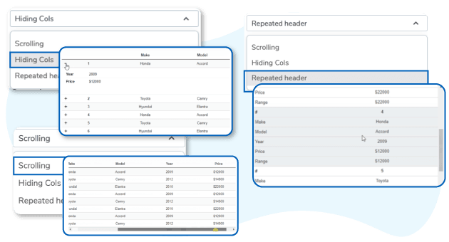
The responsive mode is something crucial to display HTML tables on WordPress, with sometimes small space on your layout whether you're on desktop or on small devices (mobiles, tablets). WP Table Manager has 3 responsive modes: Scrolling, Hiding Cols and Repeated header with several responsive settings.
For more features, get back to the main plugin page >

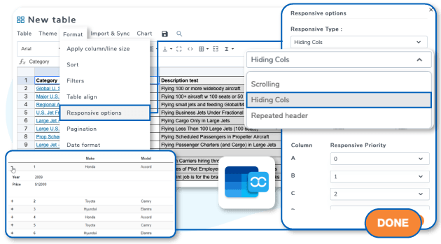
Responsive table using column hiding and display priority
This WP Table Manager responsive mode is the most and most customizable. Your table is displayed with a column selection ordered by priority, the others being hidden, following the width available. You can force a column display at any size of the screen using a menu with checkbox.
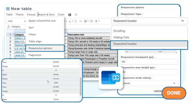
Responsive table using data header group mode
This tables responsive mode displays, once a particular screen width is reached, a row data below the header information. You can set a particular responsive breakpoint (width) and table max-height for each table, which is very convenient depending where your table is placed.


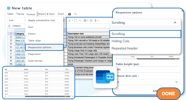
Responsive table using scrolling
The scroll responsive mode is fixing table width and height and then display overflows, both horizontal and vertical. The horizontal scrolling will depend on your content width and you can select how many columns will freeze while scrolling.
How to choose the right responsive mode for your HTML tables
All the responsive mode listed here can be used with cell or column freezing and tables fixed width and height. All the responsive modes can be relevant depending on the data shown and the most used devices.

WP Table Manager, responsive tables in Video
Join our 60,000+ members & get support and new version updates
year
- MULTI DOMAIN / MULTI SITE
- 1 YEAR UPDATE
- 1 YEAR SUPPORT
- NO RECURRING PAYMENT
- NO DATE LIMITED
WORDPRESS BUNDLE
The Bundle gives access to ALL WordPress plugins and can be used on unlimited websites. In addition, you will have full access to technical support and update on each plugin for all year.
The time is now! Boost your efficiency and gain that competitive edge. Give The Bundle a try.

Recent testimonials & ratings

Love it!
Abrahamwarsaw,05 May 2025

Fast and helpful customer support
Ivan V.London,UK,14 June 2025

Very useful with Excel support
My A.Barcelona,CT,Spain, 0800212 June 2025

Top table plugin for WP
Michel Y.London,UK,20 June 2025
FAQ: WordPress HTML Tables Responsive on Mobile
WP Table Manager has three responsive modes: Scrolling, Hiding Columns, and Repeated Header (Data Header Group), each adapting table display differently based on screen size.
In this mode, columns are prioritized and hidden based on the available screen width, with an option for users to manually show or hide columns using a checkbox menu.
This mode transforms table rows into grouped header and data blocks when the screen width is small, allowing content to be displayed in a more readable stacked format.
Scrolling mode sets fixed table width and height, enabling horizontal and vertical scrolling with options to freeze a number of columns during horizontal scroll.
Yes, all responsive modes can use cell or column freezing to keep key data visible while scrolling or adjusting the table on smaller screens.
The choice depends on your data type and typical device usage. Scrolling suits wide tables, hiding columns is good for hierarchical content, and data header group mode is ideal for readability on narrow screens.