Build Joomla pixel-perfect responsive tables on mobile
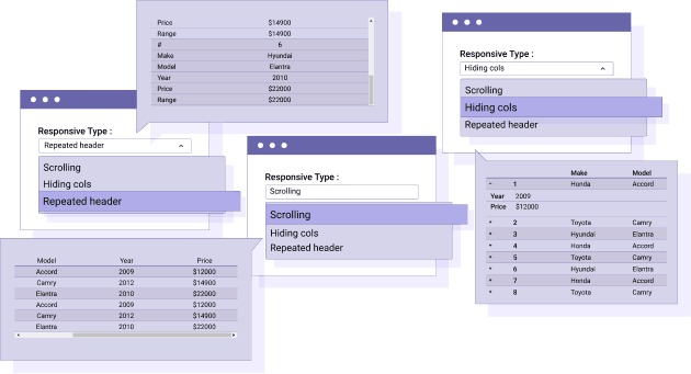
The responsive mode is something crucial to display HTML tables on Joomla, with sometimes small space on your layout whether you're on desktop or on small devices (mobiles, tablets). Droptables has 3 responsive modes: Scrolling, Hiding Cols and Repeated header with several responsive settings.
For more features, get back to the main plugin page >

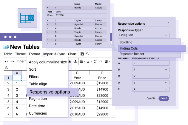
Responsive table using column hiding and display priority
This Droptables responsive mode is the most and most customizable. Your table is displayed with a column selection ordered by priority, the others being hidden, following the width available. You can force a column display at any size of the screen using a menu with checkbox.
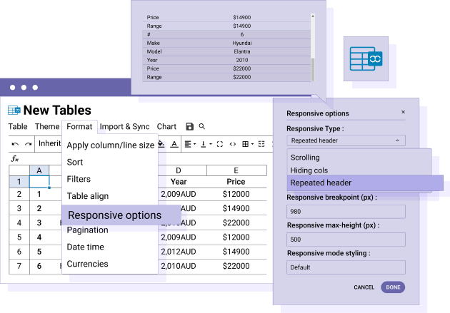
Responsive table using data header group mode
This tables responsive mode displays, once a particular screen width is reached, a row data below the header information. You can set a particular responsive breakpoint (width) and table max-height for each table, which is very convenient depending where your table is placed.


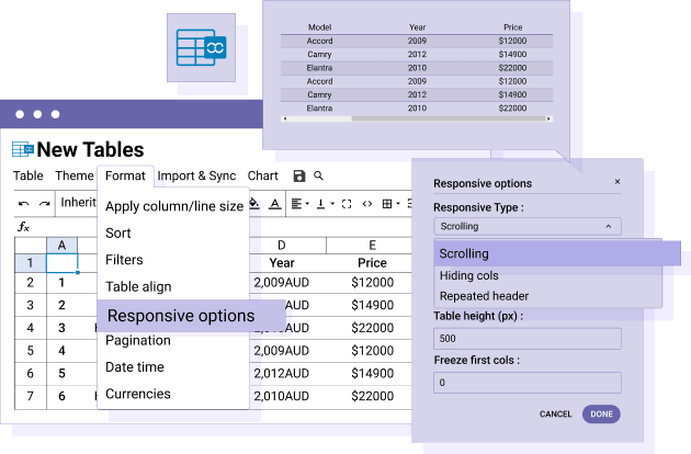
Responsive table using scrolling
The scroll responsive mode is fixing table width and height and then display overflows, both horizontal and vertical. The horizontal scrolling will depend on your content width and you can select how many columns will freeze while scrolling.
How to choose the right responsive mode for your HTML tables
All the responsive mode listed here can be used with cell or column freezing and tables fixed width and height. All the responsive modes can be relevant depending on the data shown and the most used devices.

Join our 60,000+ members & get support and new version updates
year
- MULTI DOMAIN / MULTI SITE
- 1 YEAR UPDATE
- 1 YEAR SUPPORT
- Dropfiles extension
- Droppics extension
- DropEditor integration
- NO RECURRING PAYMENT
- NO DATE LIMITED
- Latest Joomla 3, 4 & 5 ready
YEAR
- MULTI DOMAIN / MULTI SITE
- 1 YEAR UPDATE
- 1 YEAR SUPPORT
- Dropfiles extension
- Droppics extension
- DropEditor integration
- NO RECURRING PAYMENT
- NO DATE LIMITED
- Latest Joomla 3, 4 & 5 ready
JOOMLA BUNDLE
The Bundle give access to ALL Joomla extensions and can be used on any websites. In addition, you will have full access to technical support and update on each extension for all year.
The time is now! Boost your efficiency and gain that competitive edge. Give The Bundle a try.

Clients Testimonials & Ratings
 Droptables - Joomla Table Manager
Rating source: 16 user-submitted reviews at: Joomla.org
FAQ: Responsive HTML Tables on Mobile with Droptables
Droptables uses advanced responsive layouts and CSS techniques to ensure your Joomla HTML tables look great and function perfectly on any mobile or tablet device without horizontal scrolling.
Yes, you can customize table colors, fonts, borders, and layout specifically for mobile views using Droptables’ visual editor and responsive options.
Absolutely, all interactive features like column sorting, filtering, and search remain fully functional on mobile devices for the best user experience.
Droptables offers smart truncation, column hiding, and an adaptive toggle between horizontal scrolling and stacked views to fit wide tables on small screens seamlessly.
Yes, you can easily embed responsive tables anywhere in Joomla content or modules via shortcode or plugin integration.